Microsoft debuts a more buttoned-up look for Copilot - Engadget
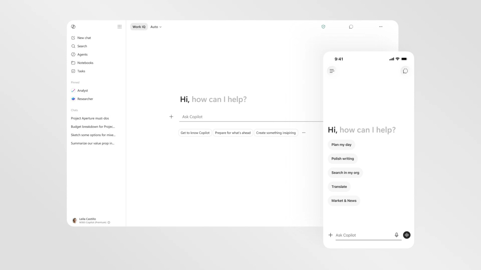
The AI assistant had its personality stripped in pursuit of a more consistent experience. Copilot is getting yet another visual overhaul as Microsoft reconsiders its approach to AI across Windows and its various apps. The new changes are focused on the version of Copilot accessible in Microsoft 365, and visually streamline the AI assistant to using it more consistent across apps like Word, PowerPoint and Excel. The most striking difference in Copilot's new look is how little color it has. You can still get Copilot to produce full-color outputs and it will reference other apps by their colorful app icons. By default, though, the Copilot interface is now a largely black and white, text-forward affair. Part of this change was driven by a desire to make everything more readable and responsive, but Microsoft suggests it's also reflective of an attempt to "craft intelligence that feels present but not imposing." Microsoft has introduced a new design for Copilot pic.twitter.com/Bxdg6dKbfZ That approach also applies to the tweaks Microsoft querying the AI assistant itself. The Microsoft 365 Copilot app and the Copilot experience in Microsoft apps feature a new "prompt surface" that changes
Source: For the complete article, please visit the original source link below.